

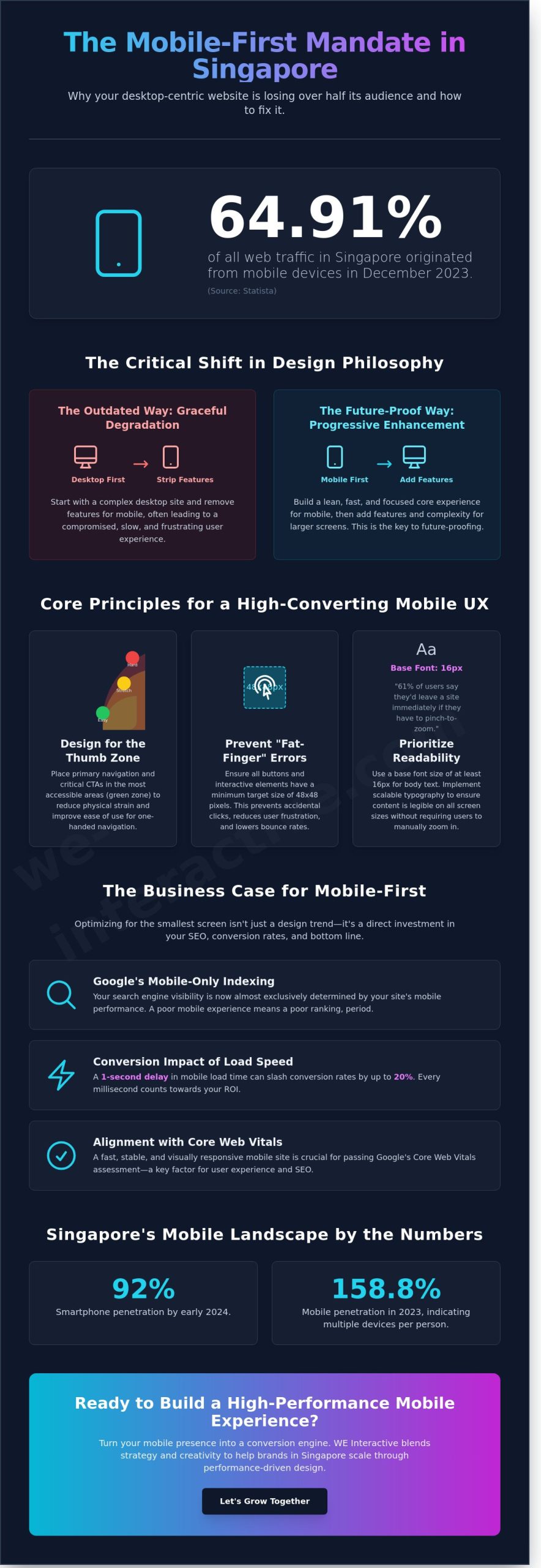
In December 2023, Statista data revealed that 64.91% of all web traffic in Singapore originated from mobile devices. If your site still prioritizes the desktop experience, you’re likely losing more than half of your potential audience before they even see your value proposition. Mastering mobile-first web design best practices is no longer an optional upgrade; it’s a strategic necessity to prevent high bounce rates and protect your SEO rankings in an increasingly competitive digital landscape.
WE understand the frustration of managing complex responsive layouts that don’t quite deliver the results you expect. You want a website that converts as effectively on a smartphone during a Raffles Place commute as it does on a laptop in the office. This guide promises to help you bridge that gap, showing you how to optimize Core Web Vitals and create seamless user journeys that drive measurable growth.
WE’ll walk through the essential strategies to transform your mobile presence into a high-performance engine that turns clicks into conversations. Let’s start growing together by building a digital experience that’s both analytically precise and creatively powerful.
Key Takeaways
- Understand why progressive enhancement is replacing traditional degradation to ensure your digital presence remains future-proof in the 2026 landscape.
- Master the mobile-first web design best practices that prioritize the “Thumb Zone” and visual hierarchy to guide users effortlessly toward your goals.
- Unlock high-performance growth by implementing next-gen image formats and speed optimizations that convert every millisecond into measurable ROI.
- Transform your mobile interface into a conversion engine by mastering the art of low-friction forms and high-impact calls-to-action.
- Discover how WE Interactive blends strategy and creativity to help regional brands in Singapore scale through sustainable, performance-driven design.
Understanding Mobile-First Web Design in 2026
Mobile-first web design in 2026 isn’t just a technical choice; it’s a fundamental shift in how WE approach digital storytelling. It marks the definitive end of “graceful degradation,” where designers would build for desktop and then strip away features for smaller screens. Instead, the industry has embraced progressive enhancement. This strategy starts with a lean, high-performance foundation for the smartphone and adds layers of complexity only as screen real estate increases. In a market like Singapore, where smartphone penetration exceeded 92% by early 2024, starting with the smallest screen ensures your brand remains accessible to the vast majority of your audience from the very first click.
The psychology of the mobile user is built on immediate intent. Unlike desktop users who might engage in leisurely, multi-tab browsing, mobile users are usually looking for a specific answer, a local service, or a quick transaction. If your site doesn’t deliver that value within seconds, they’ll bounce. Mastering mobile-first web design best practices allows you to capture this high-intent traffic, turning fleeting impressions into meaningful brand interactions. It’s about building trust through speed and clarity, positioning your brand as a responsive partner in the user’s daily life.
Mobile-First vs. Responsive Design: The Core Differences
While Responsive Web Design provides the technical framework of fluid grids and media queries, mobile-first is a content-driven philosophy. Responsive design often focuses on “fitting content” into different boxes. Mobile-first forces you to prioritize your most valuable brand messages because space is at a premium. You can’t afford clutter when every millimetre counts. This approach shifts the focus toward “designing for the thumb,” ensuring that navigation and call-to-action buttons are placed within the natural reach of a user’s grip. When you start small, you’re forced to identify what truly matters to your customer, creating a more potent and focused brand story.
The Business Case for Prioritizing Small Screens
Prioritizing small screens is a strategic move that directly impacts your bottom line. Google now operates on mobile-only indexing standards, meaning your search visibility is tied almost exclusively to your mobile performance. High-quality website development must align with Core Web Vitals to ensure your site isn’t just pretty, but fast and stable. In the competitive Singaporean landscape, a one-second delay in mobile load time can slash conversion rates by up to 20%. By reducing friction in the customer lifecycle, you’re not just making a sale; you’re building long-term retention. WE believe that when you optimize for the most constrained environment, you create a superior experience for everyone, unlocking growth and amplifying your brand authority across every device.
Core Principles of Mobile UI/UX: Beyond Aesthetics
Designing for mobile isn’t just about shrinking a desktop layout. It’s a strategic shift toward engineering experiences that empower users. With Singapore’s mobile penetration hitting 158.8% in 2023 according to IMDA data, your digital presence must be optimized for the palm of a hand. This is where mobile-first web design best practices become your competitive advantage, turning a small screen into a high-conversion engine.
The “Thumb Zone” framework dictates our spatial logic. Most users navigate with one hand, meaning critical interactions must sit within the natural arc of a thumb’s reach. We place primary calls to action in the center and bottom thirds of the screen to reduce physical strain. To prevent “fat-finger” errors, every button follows a minimum target size of 48×48 pixels. This precision ensures users don’t accidentally trigger the wrong link, which is a common source of bounce rates. We often look to the U.S. Web Design System principles to ensure our foundations remain accessible and consistent across all devices.
Visual hierarchy on a 6 inch display requires ruthless clarity. White space isn’t empty; it’s a tool to guide the eye. We utilize scalable typography with a base size of at least 16px. This ensures readability without forcing users to pinch-zoom, a friction point that 61% of users say would make them leave a site immediately.
Content Inventory and Prioritization
WE adopt a “Kill Your Darlings” approach when auditing content. Mobile real estate is expensive, so we strip away non-essential desktop clutter that dilutes your message. Every element must earn its place. We structure content for scannability by using punchy headlines and bullet points that deliver value in seconds. Through progressive disclosure, we keep the interface clean by showing vital info first and hiding deeper technical details behind “Read More” toggles. This keeps the user focused on the journey without feeling overwhelmed by data.
Intuitive Navigation for the Modern User
The classic hamburger menu is no longer the only solution. Many high-performance interfaces now favor bottom-bar navigation because it keeps primary links within the Thumb Zone. For complex sites, we integrate breadcrumbs and robust search functionality to help users find answers in three taps or less. This level of precision is central to our approach to website development, where we blend the art of creativity with the science of performance. Consistent branding across these touchpoints builds the trust necessary for conversion, ensuring your brand feels familiar whether viewed on a commute in Raffles Place or a desktop in a home office.
Technical Best Practices for Performance and SEO
Performance is the heartbeat of any mobile strategy. In Singapore, where mobile penetration reached 158.8% in 2023, users expect instant gratification. Speed is revenue. Research shows that a one-second delay in mobile load times can impact conversion rates by up to 20%. To elevate your brand, you must move beyond basic optimization and embrace high-performance engineering.
Start by adopting Next-Gen image formats. AVIF and WebP offer superior compression, often reducing file sizes by 30% to 50% compared to traditional JPEGs without sacrificing visual quality. Combine this with lazy loading to ensure the browser only fetches assets as they enter the viewport. This approach preserves bandwidth and accelerates the initial paint, which is vital for users on the move.
Preparing for AI Search is the next frontier in mobile-first web design best practices. As we approach 2026, Large Language Models (LLMs) and Search Generative Experiences (SGE) rely on clean, semantic structures to parse data. A logical mobile hierarchy helps these AI agents extract your content accurately, ensuring your brand remains visible in AI-driven results. Additionally, Progressive Web Apps (PWAs) are becoming the standard for the 2026 digital ecosystem. They provide an app-like experience, offline capabilities, and push notifications without the friction of an app store download, significantly boosting long-term ROI.
Core Web Vitals and Mobile Rankings
Google’s Core Web Vitals are non-negotiable for mobile visibility. You must aim for a Largest Contentful Paint (LCP) of under 2.5 seconds. Layout shifts are often the silent killers of user experience. These shifts happen when dynamic ads or slow-loading custom fonts push content around as the page loads. To stabilize your Cumulative Layout Shift (CLS), always define size attributes for media and use CSS aspect-ratio boxes. For deeper technical insights into the local search landscape, see our guide on SEO Singapore to master these metrics.
Accessibility and Inclusivity (WCAG 2.2)
Inclusivity is a strategic advantage, not an afterthought. Following WCAG 2.2 guidelines ensures your site is usable for everyone. High-glare outdoor environments, common in Singapore’s bright midday sun, require a minimum color contrast ratio of 4.5:1 for standard text. Use semantic HTML tags like <header>, <main>, and <nav> to empower screen readers. It’s also essential to test your mobile-first web design best practices across a fragmented landscape of devices. From budget smartphones to the latest foldables, your design must remain resilient and accessible to every user, regardless of their hardware or OS version.
Conversion-Centric Design: Turning Clicks into Conversations
Converting a visitor into a loyal customer on a five-inch screen requires a sophisticated blend of psychology and technical precision. WE view the mobile interface as a high-stakes environment where every pixel must earn its place. Implementing mobile-first web design best practices means moving beyond aesthetics to focus on the “Art and Science” of the Call-to-Action (CTA). A 2023 study by Contentsquare revealed that mobile conversion rates often lag 50% behind desktop; closing this gap requires a strategic approach to user friction.
Reducing form friction is the most immediate way to elevate your ROI. Mobile users don’t want to type; they want to tap. We prioritize single-column layouts and leverage browser auto-fill capabilities to minimize effort. By reducing form fields from six to three, businesses often see a 67% increase in completion rates. We also utilize micro-interactions, such as a subtle button glow or a loading bar, to provide instant feedback. These small animations confirm that the system has registered the user’s intent, preventing the frustration of double-tapping or abandonment.
Social proof must be integrated with surgical precision to avoid cluttering the limited screen real estate. Instead of heavy blocks of text, we use high-impact trust badges and condensed star ratings. Positioning a “CaseTrust” or “Singapore Quality Class” logo near the final checkout button builds immediate credibility. It’s about making people feel secure in their decision at the exact moment they’re ready to commit.
The Mobile Lead Generation Framework
Success on mobile depends on keeping the primary goal within reach of the user’s thumb. Sticky CTAs ensure that the “Book Now” or “Enquire” button remains visible as the user scrolls through your story. In the Singapore market, integrating direct WhatsApp buttons or click-to-call features is essential for immediate engagement. This seamless transition from browsing to chatting is a core component of how WE social media marketing strategies drive high-intent traffic to mobile-optimized landing pages.
A/B Testing and Data-Driven Optimization
Your mobile site is a living asset that requires constant tuning to stay competitive. We use heatmapping tools like Hotjar to identify exactly where users drop off or get stuck in the navigation. Iterative design allows us to test different button placements or headline variations to see what resonates with your specific audience. This analytical rigor is how we connect mobile behavior to performance marketing ROI, ensuring every S$1 spent on ads works harder to generate measurable growth. From clicks to conversations, from impressions to conversions, our focus remains on significant, sustainable results.
Ready to turn your mobile presence into a powerful force for growth? Partner with WE Interactive to build a high-converting mobile experience.
The WE Interactive Approach: Shaping Digital Success
WE Interactive doesn’t just build websites; we engineer digital growth engines. Since 2009, we’ve delivered over 700 campaigns by blending strategy, creativity, and performance. Our approach ensures every design choice translates into measurable business value. By 2026, mobile-first web design best practices will be the baseline for survival in the competitive Southeast Asian market. We help you stay ahead of that curve.
Our “Growing Together” philosophy is the heartbeat of our agency. We don’t believe in one-off projects. We design for long-term scalability so your digital presence expands alongside your ambitions. It’s about making people feel a connection to your brand while delivering the speed and ease they expect. We balance the art of visual storytelling with the science of high-conversion architecture. This ensures your site remains relevant as user behaviors shift.
In 2024, we transformed a legacy retail platform that was struggling with a 72% mobile bounce rate. By prioritizing mobile-first web design best practices, we optimized the checkout flow and cut page weight by 55%. Within one quarter, mobile conversions increased by 42% and organic search traffic grew by 28%. This isn’t just design; it’s a strategic overhaul for the mobile-first era that delivers significant, sustainable growth.
Regional Expertise in Singapore and Beyond
Dominating the local market means understanding the unique digital ecosystems of Jakarta, Bangkok, and Singapore. We provide specialized insights for China Market Entry, helping brands navigate mobile-dominant platforms like WeChat and Xiaohongshu (XHS). Beyond the interface, we leverage CRM automation to nurture mobile leads into loyal, lifelong customers. We ensure your brand resonates across borders while staying rooted in local consumer behavior and regulations.
Partnering for Performance
Your website is your most valuable employee. Choosing the right web design partner is critical for securing a strong ROI. We don’t isolate design from marketing. Instead, we integrate SEO, Social, and Performance marketing into every pixel we create. We don’t just aim for clicks; we strive for conversations and conversions. Our team is ready to help you unlock your brand’s full potential and prepare for the 2026 landscape. Ready to take the next step? Elevate your brand with WE Interactive.
Future-Proof Your Brand for a Mobile-Only World
Winning in Singapore’s digital landscape in 2026 requires more than just a responsive layout. It demands a shift toward performance-driven UX and technical precision that prioritizes the thumb over the mouse. By integrating mobile-first web design best practices, you ensure your site loads fast, ranks high, and turns casual browsing into meaningful action. Success today is found at the intersection of Red Dot-level creative precision and rigorous performance data. It’s about balancing the art of design with the science of conversion to create a seamless user journey.
WE Interactive has been at the forefront of this digital evolution since 2009. We’ve delivered over 700 successful campaigns for global leaders like Singapore Airlines and Starbucks. Our approach helps brands navigate the critical journey from clicks to conversations, ensuring every impression counts. We don’t just build websites; we craft strategic experiences that empower your brand to reach its full potential. We believe in Growing Together, combining our fifteen years of expertise with your unique vision to achieve sustainable growth.
Your digital presence should be a powerful force for your business. Elevate your brand with WE Interactive’s mobile-first solutions.
The next era of mobile innovation is already here, and it’s time for your brand to lead the way.
Frequently Asked Questions
What is the main difference between mobile-first and responsive design?
Mobile-first design prioritizes the mobile experience by building the foundation on small screens and layering complexity for larger devices. Responsive design typically adapts a desktop-centric layout to fit smaller screens through a process of shrinking elements. Since 2019, Google’s mobile-first indexing has made the mobile-first approach the standard for performance. WE focus on this strategy to ensure your brand’s digital presence remains a powerful force across every device.
Does a mobile-first approach hurt my desktop SEO rankings?
A mobile-first approach strengthens your desktop SEO rather than hurting it. Google transitioned all websites to mobile-first indexing as of July 5, 2024, meaning the mobile version is the primary source for ranking. If your mobile site is optimized, your desktop rankings will likely improve. WE use these mobile-first web design best practices to unlock growth and ensure your site performs under the science of modern search algorithms.
How much does a mobile-first website redesign cost in Singapore?
A professional mobile-first website redesign in Singapore typically starts from S$8,000 for standard business sites and can exceed S$50,000 for complex e-commerce platforms. These figures are based on 2024 industry averages for local creative agencies. Investing in a high-quality build ensures a better ROI through improved user retention. WE partner with you to deliver solutions that transform your digital story into a measurable business asset.
What are the most common mobile design mistakes to avoid in 2026?
Common mistakes include using touch targets smaller than 48×48 pixels and implementing intrusive interstitials that block content. Data from 2025 UX studies shows that 53% of users abandon sites taking longer than 3 seconds to load. Avoid heavy unoptimized images that drain mobile data. WE help brands bypass these pitfalls by balancing aesthetic innovation with technical precision to amplify your message effectively.
Can I convert my existing website to a mobile-first design without a full rebuild?
You can convert an existing site using adaptive CSS or retrofitting responsive frameworks, but a full rebuild often provides better long-term performance. Retrofitting can lead to code bloat, which slows down mobile load times. If your current site architecture is over 5 years old, a fresh start is usually more cost-effective. WE work alongside you to determine if a strategic update or a complete transformation best serves your brand’s growth.
How does mobile speed impact my Google Ads performance?
Mobile speed directly impacts your Google Ads Quality Score, which determines your cost-per-click and ad positioning. Slow landing pages lead to higher bounce rates and wasted ad spend. According to Google, a 1-second delay in mobile load times can decrease conversions by up to 20%. WE focus on optimizing these touchpoints to turn impressions into conversations and maximize your marketing automation efficiency.
What font size is best for mobile web design readability?
A minimum font size of 16px is the industry standard for mobile readability and accessibility. You should also maintain a line height of at least 1.5 to prevent text from looking cramped on small screens. Using high-contrast colors ensures your content is legible even in bright outdoor conditions. WE prioritize these human-centric details to elevate your brand’s experience and ensure your work speaks louder than words.
Do I need a mobile app if my website is mobile-first?
You don’t necessarily need a mobile app if your mobile-first website provides a seamless, high-performance experience. Progressive Web Apps (PWAs) now offer app-like features, such as offline access and push notifications, without the high development costs of native apps. Decisions should be data-driven based on your specific user behavior and business goals. WE help you navigate these strategic choices to empower your digital success.